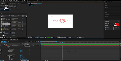
For this project Del decided to use Adobe After Effects to
edit and piece our trailer together. Del chose to upgrade to this program
rather than using my original program serif movie plus to become more precise
with colour sound and transitions.
Before piecing together any of the footage Del decided to work backwards
beginning with the title sequence which included the title following with a
shot of action and the coming soon screen with the credits.
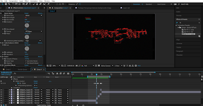
Between the title of the film and the coming soon title, Del
added a sequence of the protagonist being terrified being reassured by their
friend and the friend later being attacked by the antagonist. We chose to add a
grain effect once again to consistently have the handheld camera effect, the
purpose of this sequence being added in the end was to contradict the Todorov’s
theory eliminating the new equilibrium and continuing the trailer with a
constant disequilibrium narrative. This creates the intention of leaving the
audience confused and interested, and also becomes unexpected as the trailer
appears to be coming to an end but has a continuation of bad encounters.
The advantage of using this software is that Del is also
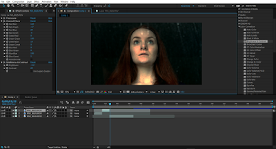
able to add and adjust the colour tones and contrast with ease. We took all raw
cuts and before piecing anything together I chose to apply the colour correction
filter to each shot that Del was going to use, applying dark tones and
contrasts to make the genre of horror more apparent for the audience. Del also
added a green/yellow colour on some shots to make the characters and locations
appear to be more creepy and uneasy.
After applying the effects Del started joining shots
together, after looking and researching the way trailers are put together, Del
was able to understand how the moments of calm moods and high energy fluctuate
from the beginning to the end. To make these moments of fluctuating moods Del
had to rely on the sounds we used, this became easy to do with this program as
Del was able to layer, crop and alter the volume and pitch of the sound to the
specific moments with precision.
Overall, editing this trailers first cut was hard because of
the time that had to be put into consideration with where sounds and cuts with
start and end. However, with more practice it became easier to understand to
use, we used an old grainy effect through the majority of it to make it appear
to be more creepy and scary linking with the conventions of the genre of
horror. This has all become easy from the change of software from what we have
both used in AS,


No comments:
Post a Comment