Wednesday 16 March 2016

Magazine layout

Here is a basic mock up of our magazine we decided it would more realistic to go with an already well known magazine brand than creating our own. I felt that Total Film magazine would be more fitting as it showcases all genres of films and it adapts seamlessly to each film it shows. This was something that made choosing this magazine seem far more attractive it meant that I was able to be far more creative as the magazine is too. This meant that although our magazine was in fact an imitation of the original it would still appear to realistic and of a high standard, due to the flexibility of the original magazine.  


Examples of some of Total Films issues, showcasing their creative particularly the difference in the title to suit each film. 


When picking a total magazine to focus on and to compare to. I took inspiration from many magazines but tried to focus on magazines that had two people as their main image as this is how I intend to layout our magazine. With the Masthead usually staying in the same place remaining at the top of the page this meant that this convention of the particular magazine would have to stay the same. Other features of the magazine such as the positioning of the film title were interchangeable as they varies from cover to cover. 


Monday 14 March 2016

Final Film title change

We decided to change our film title as Octob3r 1 boxed our trailer into only having Halloween connotations. Our final name change to Th1rt3enth made more sense as it more associated widely with the Horror genre rather than it just being vaguely Halloween. Besides changing to Th1rt3enth because of it being more broadly associated with horror, it mainly our story-line change that prompted Del's realisation that our film title no longer fits the actual story and trailer. Titles are far more memorable when the actual title matches the conventions of the trailer.


When making the logo Del decided to stick to red like the logo I had made previously. With red holding connotations of blood and with red is a very emotionally intense colour. The colour dark red is associated with courage but could also be associated with malice and wrath. 


Del decided to animate the title as it would help the audience to understand what our trailer may be about even more. Using Adobe After Effects he added the Glitch effect this digital distortion of an already blood red title gives and overall feel of displacement (the hint at something going wrong) the title being changed and then going back to normal is somewhat is symbolic of the metamorphosis  our main character Hannah has to go through to defeat the antagonist with losing her sense of identity. 


Sunday 13 March 2016

First Cut feedback

From the our first viewing to a our target audience, we established various areas which required improvement. The main areas for improvement was in the editing process, there were too many moments of darkness and segments of dead time within the trailer. As if it required more shots in the beginning to give the trailer a sense of continuity and to also tell the narrative at the same time. we were also told to add more sounds to make the clips more understandable, such as the mid shot of Rasharn breathing because it wasn't clear. the final part was just small details to improve on such as the removing on grain effect where no appropriate like in the beginning with the institutional information. Overall, using this method of retaining feedback, I was able to understand the changes required to make and also what has worked well as I would be aware if I have appealed to my target audience. 

Areas for improvement: 

- Lose blank segments with no action
- Extend some shots shown in the first half
- Record more shots to add to the beginning 
- Add foley sound to raw cuts
- Make institution logo without grain/glitch effects


Credit: Del

Filming Schedule

We found it difficult setting strict dates for filming as peoples free time varied depending upon availability, so we decided to separately film each character and piece it together in the final editing phase to place them together. These aren't exactly dates we specifically set up to film, it was the dates available for the actors.

Day one of shoot: 17th December 2015
Actors: - Mia
Props/Equipment needed: - Camera- Tripod
Costumes needed: Mia - black t-shirt, grey stone wash jeans, converse trainers
Day two of shoot:  18th December 2015
Actors: - Rasharn
Props/Equipment needed: - Camera- Hand held tripod stabilizer 
Costumes needed: Rasharn - Leather cap, black t-shirt, red and black flannel shirt, black denim jeans, black fadidas flux trainers
Day three of shoot: 5th January 2016 
Actors: - Rasharn - Mia- Sam
Props/Equipment needed: - Camera- Hand held tripod stabilizer - Knife
Costumes needed: Rasharn - Leather cap, black t-shirt, red and black flannel shirt, black denim jeans, black Adidas flux trainersMia - black t-shirt, grey stone wash jeans, converse trainersSam - White t-shirt, blue hoodie, light grey denim jeans, white converse trainers
Day four of shoot: 7th January 2016 
Actors: - Sam- Del
Props/Equipment needed: - Camera- Tripod- Knife
Costumes needed: Sam - White t-shirt, blue hoodie, light grey denim jeans, white converse trainersDel - Green hoodie, green flannel shirt, black destroyed denim jeans, grey distressed boots
Day five of shoot:  8th January 2016
Actors: - Sam- Del- Rasharn
Props/Equipment needed: - Camera- Hand held tripod stabilizer- light reflector
Costumes needed: Sam - White t-shirt, blue hoodie, light grey denim jeans, white converse trainersDel - Green hoodie, green flannel shirt, black destroyed denim jeans, grey distressed bootsRasharn - Leather cap, black t-shirt, red and black flannel shirt, black denim jeans, black Adidas flux trainers

Credit: Del

First cut feedback

From the our first viewing to a our target audience, we established various areas which required improvement. The main areas for improvement was in the editing process, there were too many moments of darkness and segments of dead time within the trailer. As if it required more shots in the beginning to give the trailer a sense of continuity and to also tell the narrative at the same time. we were also told to add more sounds to make the clips more understandable, such as the mid shot of Rasharn breathing because it wasn't clear. the final part was just small details to improve on such as the removing on grain effect where no appropriate like in the beginning with the institutional information. Overall, using this method of retaining feedback, I was able to understand the changes required to make and also what has worked well as I would be aware if I have appealed to my target audience. 

Areas for improvement: 

- Lose blank segments with no action
- Extend some shots shown in the first half
- Record more shots to add to the beginning 
- Add foley sound to raw cuts
- Make institution logo without grain/glitch effects


Friday 4 March 2016

Trailer Editing Walkthrough

For this project Del decided to use Adobe After Effects to edit and piece our trailer together. Del chose to upgrade to this program rather than using my original program serif movie plus to become more precise with colour sound and transitions.  Before piecing together any of the footage Del decided to work backwards beginning with the title sequence which included the title following with a shot of action and the coming soon screen with the credits.


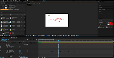
 The title was created using a bold red text in a ‘Darlin’ font. This font had an uneven, distressed presentation to it, along with the bold red text used had been perfect in portraying the conventions of the Horror genre. Del chose to use a black background to contrast with the red colouring in all titles, and chose to add a code on the top left to give it the handheld camera effect that is seen in the trailer. After Del applied a grain/noise effect to reinforce the handheld camera effect along with a glitch/twitch effect to make the titles have an uneasy disturbed effect.


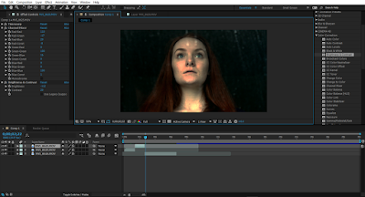
Between the title of the film and the coming soon title, Del added a sequence of the protagonist being terrified being reassured by their friend and the friend later being attacked by the antagonist. We chose to add a grain effect once again to consistently have the handheld camera effect, the purpose of this sequence being added in the end was to contradict the Todorov’s theory eliminating the new equilibrium and continuing the trailer with a constant disequilibrium narrative. This creates the intention of leaving the audience confused and interested, and also becomes unexpected as the trailer appears to be coming to an end but has a continuation of bad encounters.


The advantage of using this software is that Del is also able to add and adjust the colour tones and contrast with ease. We took all raw cuts and before piecing anything together I chose to apply the colour correction filter to each shot that Del was going to use, applying dark tones and contrasts to make the genre of horror more apparent for the audience. Del also added a green/yellow colour on some shots to make the characters and locations appear to be more creepy and uneasy.


After applying the effects Del started joining shots together, after looking and researching the way trailers are put together, Del was able to understand how the moments of calm moods and high energy fluctuate from the beginning to the end. To make these moments of fluctuating moods Del had to rely on the sounds we used, this became easy to do with this program as Del was able to layer, crop and alter the volume and pitch of the sound to the specific moments with precision.


Overall, editing this trailers first cut was hard because of the time that had to be put into consideration with where sounds and cuts with start and end. However, with more practice it became easier to understand to use, we used an old grainy effect through the majority of it to make it appear to be more creepy and scary linking with the conventions of the genre of horror. This has all become easy from the change of software from what we have both  used in AS, 

Props for filming


Torch and matches: We used a torch within our trailer for the protagonist to use when searching the forest for the killer. the torch in hand of one character, particularly in a long shot can demonstrate the characters vulnerability. This was the intention as we wanted Sam to look intimidated and the torch also can play as a spotlight on the area she intends on searching which created an opportunity for moments of fright.


iPhone 6s camera: The iPhone 6s camera was used not only used for characters to reinforce the convention of teenagers being digital natives, but also to record the scenes where Sam is begin attacked in the kitchen by the killer. The handheld phone camera effect was effective within our sequence as it played as a visual through the characters perspective. As well as the visual effects, it had on the whole scene it also gave great quality shots, with the 12 mega-pixel camera and the auto focus which enabled for sudden and almost jerky shots to still remain in focus.


Knife: The knife was present in the match on action shot with the protagonist Hannah standing by window and the killer approaching her in the next shot from behind with the knife scrapping on the door. The knife is a common prop to use in the genre of horror as it has negative representations, linking to killing or attacking a victim. Use of the knife in horror films is often overplayed so we tried not to make it the stand out weapon in our trailer, the knife created tension visually, as well as digetically with the intense scraping used to of set the music.


Dishes, cutlery and broken glass: We used these items to distress the scenes setting to show the impact of the killers presence. We showed the commotion an the destruction the killer created when he was simply near this added to the audiences fear of the antagonist as it showed how frightening he is.